Have you ever browsed through a website but felt a block midway? Like something is not right with the site, and you hesitate to stay on it or even completely lose interest? This common experience often occurs when the content or design fails to convince you to continue exploring. One of the main culprits behind this disengagement is ineffective calls-to-action (CTAs).
For your website to be effective, it needs to be persuasive. This art of persuasion involves influencing users to believe, agree with, or act on something through convincing arguments, appeals, or actions. It goes beyond mere communication; it requires a deep understanding of human behavior, emotions, and motivations to effectively guide decision-making processes.
CTAs play a vital role in guiding users through a website and persuading them to take desired actions, such as subscribing to a newsletter, purchasing a product, or downloading a resource. When these CTAs are vague, generic, or unappealing, they fail to provide the necessary motivation for users to stay engaged.
Here is how you can craft compelling CTAs that will increase your conversion rate.
Clarity is Key
Clear and concise CTAs are essential to guide users effectively. When a user sees a CTA, they should immediately understand what action is being requested and what benefit they will receive. Always say more with less. Avoid jargon or overly complex language that could confuse users.
Imagine you are managing a website for a consultancy services company. Instead of using a CTA that says, “Learn About Our Comprehensive Solutions,” which is vague and filled with jargon, use a clearer, more concise CTA like “Book Your Consultation.” This direct approach tells users exactly what they will receive—a free consultation—without any unnecessary complexity, making it more likely they will click and engage.

Use Strong, Active Verbs
Strong verbs convey action, energy, and clarity, making CTAs more vivid and engaging. They help readers visualize the action and understand the writer’s intent more clearly, which keeps their interest.
Phrases like “Get,” “Discover,” “Start,” or “Join” are more compelling than their passive alternatives.
A fitness app could use the CTA “Get started today” instead of a less engaging “Try Us.” The word “Start” implies an action that users should take immediately, making the CTA more dynamic and persuasive.
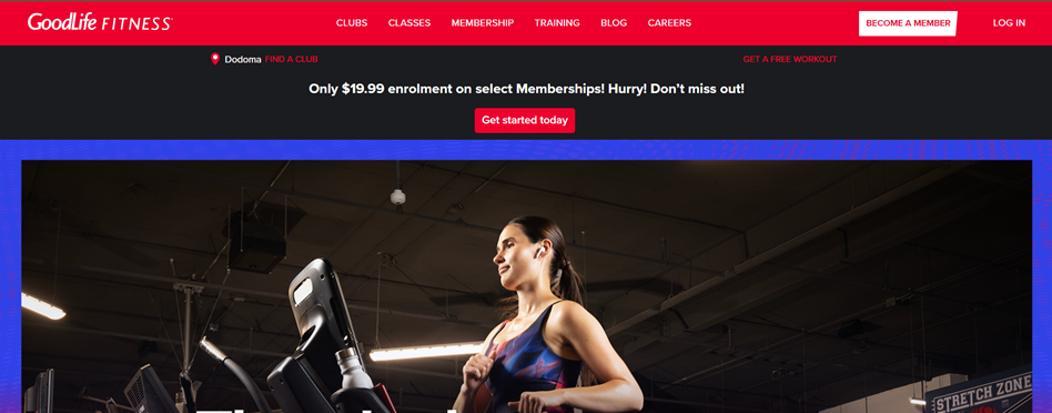
Create a Sense of Urgency
Creating a sense of urgency can be a powerful motivator for prompting users to act quickly. When users perceive that an offer is available for a limited time or that quantities are running out, they are more likely to make a prompt decision to avoid missing out.
For example, an e-commerce site selling fashion items could use the CTA “Shop Now – Limited Time Deal” to urge customers to make a purchase before the items run out. This urgency compels users to act immediately rather than postponing their decision, which can often lead to missed opportunities.
By strategically incorporating urgency into your CTAs, you can drive faster responses and higher engagement from your audience.
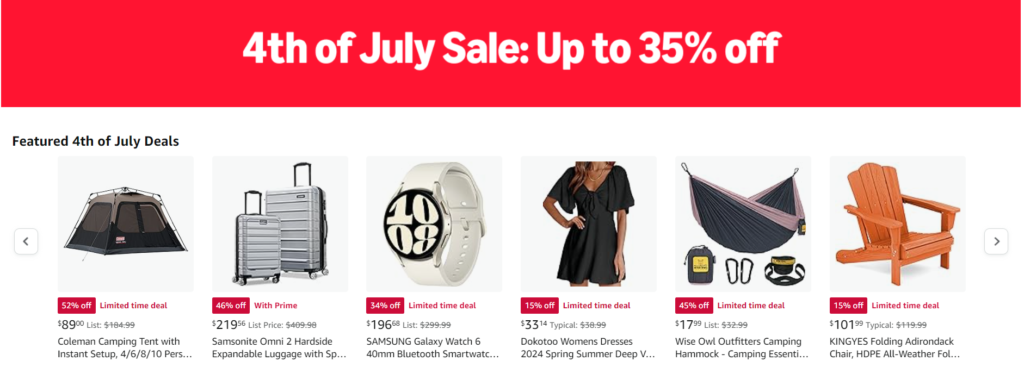
Optimize Button Design
The design of your CTA buttons is just as important as the wording. Visually appealing buttons that stand out on the page can increase the likelihood of user interaction. To achieve this, use contrasting colors that make the buttons pop against the background, ensuring they immediately draw the user’s eye.
Additionally, the size of the button should be appropriate—not too small to be overlooked and not too large to be overwhelming. Incorporating ample whitespace around the buttons can also help to focus attention and reduce visual clutter, making the CTA more prominent. The button text should be in a readable font and size, so that it’s easy to understand at just a glance.
On a travel booking website, a brightly colored button with the text “Create Your Dream Vacation” in a bold, easy-to-read font can attract more clicks compared to a bland, generic button. The contrast between the button and the background ensures it catches the user’s eye.

Placement Matters
Where you place your CTAs on the page can significantly impact their effectiveness. Position CTAs where users are most likely to see them and at points in their journey where they are ready to take action.
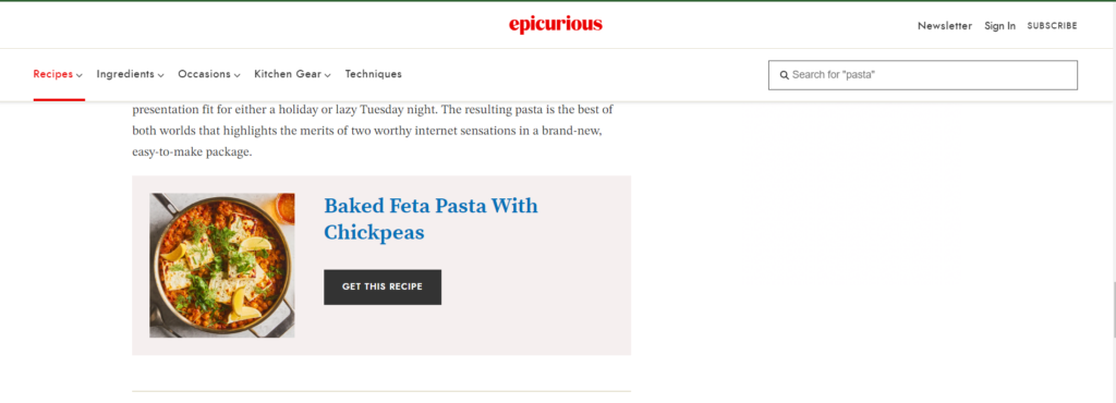
Take a blog post about healthy recipes for example, a well-placed CTA at the end of the article saying, “Get This Recipe” can convert readers who have enjoyed the content and are looking for more. Placing the CTA at a logical point in the user’s journey makes it more effective.
Crafting compelling CTAs is an essential part of ensuring that your website is effective. They help to guide users seamlessly toward taking the desired actions that benefit both them and your business.
If you’re looking to enhance the effectiveness of your CTAs and boost your website’s performance, don’t hesitate to inquire about Chapa Link’s website services. Our expertise will ensure your CTAs are compelling, engaging, and ultimately, effective.


[…] essentials—like price, size, and key features. Presenting these in a clean, organized layout with clear call-to-action buttons (e.g., “Add to Cart”) will enhance the shopping experience and help customers find what […]